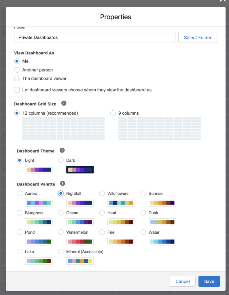
Did you know you can change the colors in your Salesforce dashboards? You can do this using dashboard palettes.
What are Dashboard Palettes in Salesforce Dashboards and How Do I Set Them Up?
Dashboard palettes are the range of colors that will be used for the charts in your Salesforce dashboards. While you cannot change the specific color for each value in a dashboard component, you can choose the color range you want to use. In addition, the dashboard palette will apply to an entire dashboard and you cannot change it for each component.
When you are in edit mode within a Salesforce dashboard, you can change the palette by:
- Click on the gear symbol in the top right corner of your dashboard to edit it’s properties
- Scroll down to the Dashboard Palette section and choose which palette you would like to use.
- Click save and the dashboard will change to the palette you have chosen.
You can play around with choosing different palettes and seeing how they change the look of your dashboard!
Please contact us at info@marksgroup.net for any Salesforce questions or support you need. Feel free to comment below. We’d love to hear your thoughts!


