Does your organization use views with just too many records? This quick tip makes navigating those beastly views much easier–and you don’t even need to create a filter! Now, the example view I’m working from only has 25 records, but this tip is especially helpful for views with more records. Read More
The Salesforce.com workbench is an amazingly useful tool when you want to deal with directly with the data on the backend. This is like having SQL access to the backend database, something that many developers, data managers (importers), and administrators need to better understand the way the Salesforce.com database is setup on the backend. Read More
Another function of the workbench is to do imports much like you would with Data Loader. It’s a bit more “programmer friendly” than data loader (which is more “standard user” friendly) in my opinion, but nevertheless a keeper.
Go ahead and login to the workbench like before. This time, go to the data menu though…. Here you can insert, update, upsert, or delete. If not familiar with these, you may want to stop as you can do some serious damage to your database. Read More
Just a final tip here, wanted to let you know about the different settings that you can manage from the workbench that are very helpful for administrators when importing data through the workbench.
Under the workbench main menu item, choose “settings”. Read More
Did you know that you can filter and sort your History and Pending tabs like you would an Excel sheet?
First thing is to enable filtering within the tab. Right click and make sure that “Filter” is checked.
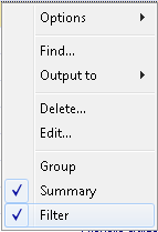
Now, use the drop down column headers with the tab to filter and sort;
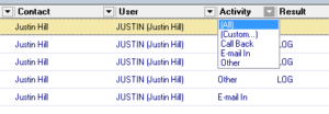
You can always tell there is a Filter enabled by looking at the bottom strip of the tab, like this;
![]()
Be aware! The filter will persist, even through a restart of GoldMine! To release the filter, you must click the “X” on the left of the Filter notification. And don’t forget about that super-cool right-click | Output To…
Try it!
Ah, Notes! The lifeblood of GoldMine. But did you know that you can make it even easier to enter in all those precious details? When you’re in the Complete or Schedule window, click the little button in the lower right hand corner (the one with the two “down arrows” on it).

And… presto! You get a larger window to write your notes in;
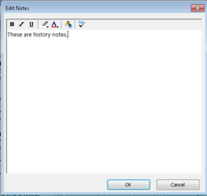
Keep in mind this doesn’t change the amount of Notes you can enter. It merely makes it easier to work inside the Notes area. Also, keep in mind that GoldMine notes accept rich text (HTML), so feel free to paste (almost) anything!
Did you know that you can “comment” pick-list items to help your users select the correct entry? I see a lot of Goldmine installations with tons of “codes”, like this;
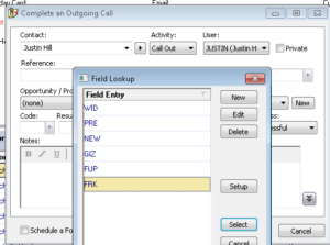
By adding a double slash (“//”), you can provide friendly descriptions for each item. Anything after the slashes is ignored. So, our list of confusing codes can now look like this;
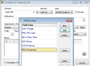
You can do this with any pick-list. It really comes in handy when training new users. Try it!
If your Zoho CRM has any active workflow custom functions, it’s good practice to periodically check for any custom function failures. To do this simply Read More
Using Zoho CRM “out of the box”, you have limited options to select from to identify duplicates on import. For example, in the Contacts module, you can choose from Email address or Contact ID. But did you know that you can create a custom field and with the right settings have it show up in the list? Here’s how… Read More
Leads can be related to many Campaigns in your CRM. You can see the list of campaigns in the Campaign related list below the lead details. The very first Campaign a Lead is connected to is it’s “Campaign Source”, and this information is stored in an inaccessible field. Read More


