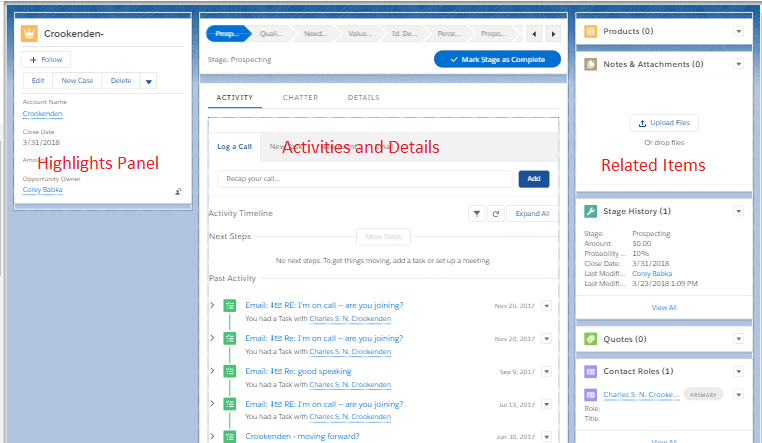
So continuing on our earlier conversation about the Sales Console, I wanted to dig a bit deeper into how we adjust the layouts within the sales console. You’ve essentially got three columns, one is a compact layout (the highlight panel), one is an activity layout (where the details exist as well), and one is the related items. We’re going to adjust that left most column which is the compact layout.
From the image below, you can see what the “out of the box” record layout is.

To get here, go to the trusty gear icon as before, select “Edit Page”. You then get to the page designer screen.

Once there, you have the options to edit a few things:
- Highlights Panel – You can adjust the order and fields that are there on there already.
- Middle section – You can adjust the order of the tabs here, as well as what’s there as custom actions or maybe the details tab (which is controlled in the record layout – that classic designer we’re all used to)
- Right section – The order and which related items are displayed. Again, this is actually controlled in the account record layout and has to be changed there.
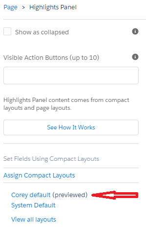
For the highlights panel, a simple click on the panel gives you the ability for a quick click to the compact layout on the right side of the designer.

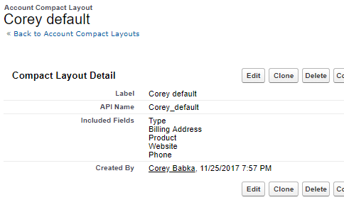
Click the compact layout being viewed (red arrow above) to go directly to that area. Once there, you’ll see something like this:

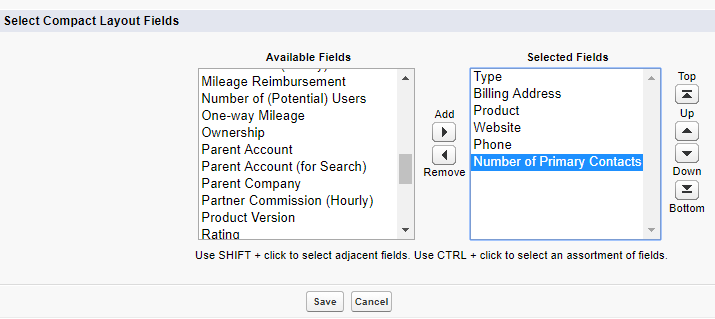
Click the Edit button, which doesn’t bring you to a designer but more of a field list like a view where you can choose order and what fields (that’s about it).

Above, I’ve added in “# of primary contacts” and all I have to do is click Save. Once done, I’ve now made a change to that layout.
Feel free to mess around a bit more, changing the tab order, limiting related lists, etc. Again, the console is perfect for those users that need to see more than one tab at a time, might as well customize it for their needs to continue to take advantage of the console design.


