This one’s a bit of another oldie (blast from the past), but it’s a good one. We all know that Reports and Dashboard tabs are great one-stop shopping spots for data. But users don’t have to go there every time they need to know something. You can set it up so people can see a report chart right on the page where they’re working. For example, when updating an opportunity, they can see a chart that’s filtered to show the latest data about the account that opportunity is associated with, without leaving the Opportunity detail page.
- Pick the report you want to display in your record page. Make sure it already has a chart, and that it’s in a folder that’s shared with users who need access (this may be the tricky part to create the chart, but refer to some of my older posts for that one). In our case, I created a report for “Products by Code” which shows a chart per opportunity of dollar breakdown.
- Go to the page layout editor for the object you’re adding a chart to. Let’s use Opportunities for this example. From Setup, click Customize | Opportunities | Page Layouts. You can do this with a custom object too. From Setup, click Create | Objects, then choose the object. Or, you can always click “Edit Layout” on the top of the object’s page your on.
- Click Edit next to the page layout.
- Click Report Charts.
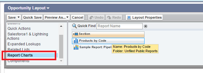
- In the Quick Find box, type the name of the report and click to find and select the report chart. You can browse up to 200 recently viewed reports by chart type in the Report Charts palette.
- Drag the chart onto the layout.
- Click the wrench icon on the chart to customize it.
- Click Save and go look at a record on the Opportunities tab. It will look something like this:
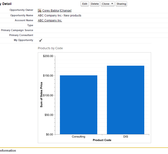
Congratulations! You’ve just saved some time and effort for everyone who works with Opportunities in your organization. You’ve made it so they can see data about an opportunity right on the page they’re working on, without having to switch over to another report.
