A new feature in Salesforce Lightning Winter ’19 are the Display Density settings which controls the amount of white space seen on the pages. There are two options:
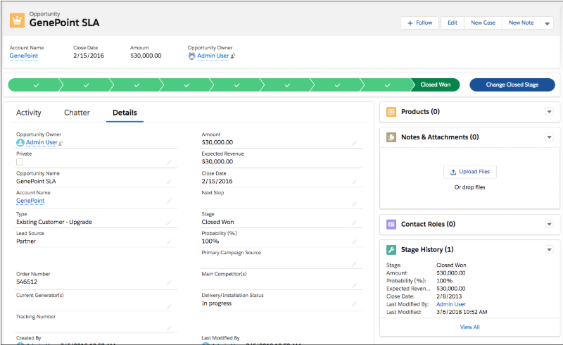
The first is the “Comfy” setting which has more white space between Salesforce elements such as fields and related lists. The label for fields is located at the top of each value. Existing organizations will have this setting as the default. The Comfy setting looks like this:

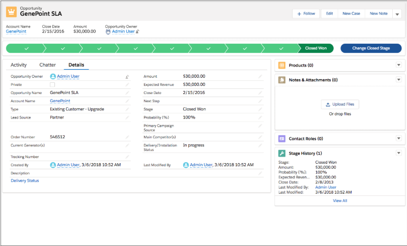
The second is the “Compact” setting which has less white space so more elements fit onto the viewing page. The label for fields is located at the side of each value allowing for up to 30% more information to be seen. The Compact setting looks like this:

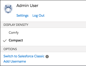
To change the Density setting, click on your username in the top right corner of the page and choose “Comfy” or “Compact” under the Display Density section.


