Have you noticed things look different in the Zoho CRM list view when you go to one of your modules? Zoho has made some user interface changes and, if you are like me, it’s taken you a little while to figure out exactly where everything is. This blog will highlight the changes so you can navigate the Zoho CRM list view screen a bit easier.
Filter Interface
Sometimes the filter panel on the left side of the screen blocks you from easily seeing the data for your records. Now you can expand and collapse this by clicking the filter symbol in the top left corner next to the list view dropdown button.
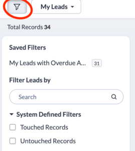
You may also notice that Zoho has now categorized the filters by System Defined, Website Activity and Filter By Fields. You can now collapse these sections so you don’t have to scroll through lots of fields if a section doesn’t apply to you.
View Options
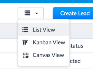
Instead of the old symbols that you clicked to choose between List View, Kanban View and Canvas View, there is now simple dropdown where you can select the view you want.
Page Details
One of the biggest changes that took me a few minutes to figure out was around how many records there were in a module or list view as well as how to move to the next page of records. This has moved from the bottom of the page to the top. The total number of records is on the left side while the pagination is on the top right. You will no longer have to select the number of records you want to view as it defaults to 100.
Data Viewing and Sorting
The first column in your list view is now frozen so as you scroll across to all your columns, you will always be able to keep track of which records you are viewing.
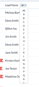
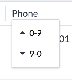
Another new feature that took me a little while to find is the ability to sort by the alphabet or search by picking a letter. This was on the far right part of the screen and is now next to the record name. For numeric sorting, it used to just indicate “Asc” or “Desc” but now it will indicate “0-9” or “9-0”.
Formatting what you view
While the old icon for managing columns was on the top left, it is now part of the new button on the right next to the last column. If you click on this icon, you have a few new options as well.
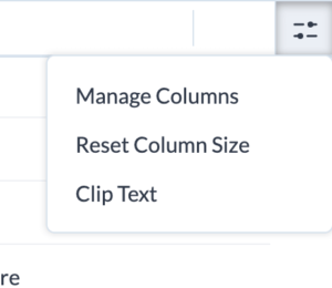
The first option is Manage Columns and like before, this allows you to add and move your columns around based on the fields in the module.
Zoho now allows you to click on the bar between each column and make the column narrower or wider. If you decide to do this, the Reset Column Size allows you to go back to the default settings
Clip or Wrap Text is a new feature that allows you to decide if you want to see the full text in a column or not. If you choose Clip Text, there will be three dots to indicate there is more text. If you choose Wrap Text, all of the text will appear over multiple lines. Wrap text is the default.
Other List View Changes
A few other changes include:
- Combining the Record Import and Create buttons and adding a dropdown for imports
- The More icon which was displayed with “…” is now called Actions with a dropdown
Finally, in the top navigation bar, the icons on the top right have been redesigned. The old icons are on the left and the new ones are on the right.
Did you know The Marks Group is offering Zoho CRM Admin training? Check out our Events page to sign up! Also, don’t forget to check out our Zoho Training Video library on our YouTube channel for more assistance with Zoho CRM and many other Zoho products! Feel free to contact us at info@marksgroup.net with any questions or if you need Zoho support. Feel free to comment below. We’d love to hear your thoughts!

